6 Ways to Display Images in Squarespace
Heads up: I use affiliate links for my fave products. If you click and purchase, I may receive a small commission at no extra cost to you.
In today's tutorial, I'm sharing 6 different ways that you can display your images in Squarespace. And it's super easy to do!
If you're new here, my name's Louise and I put out new tech tutorials every Tuesday and Thursday to help you grow your online business. Watch the video here or follow the steps below.
HIT PLAY:
WRITTEN INSTRUCTIONS:
Within a page in Squarespace, you're going to click Edit and find the grey teardrop shape. Then you're going to add an image block.
Add an image.
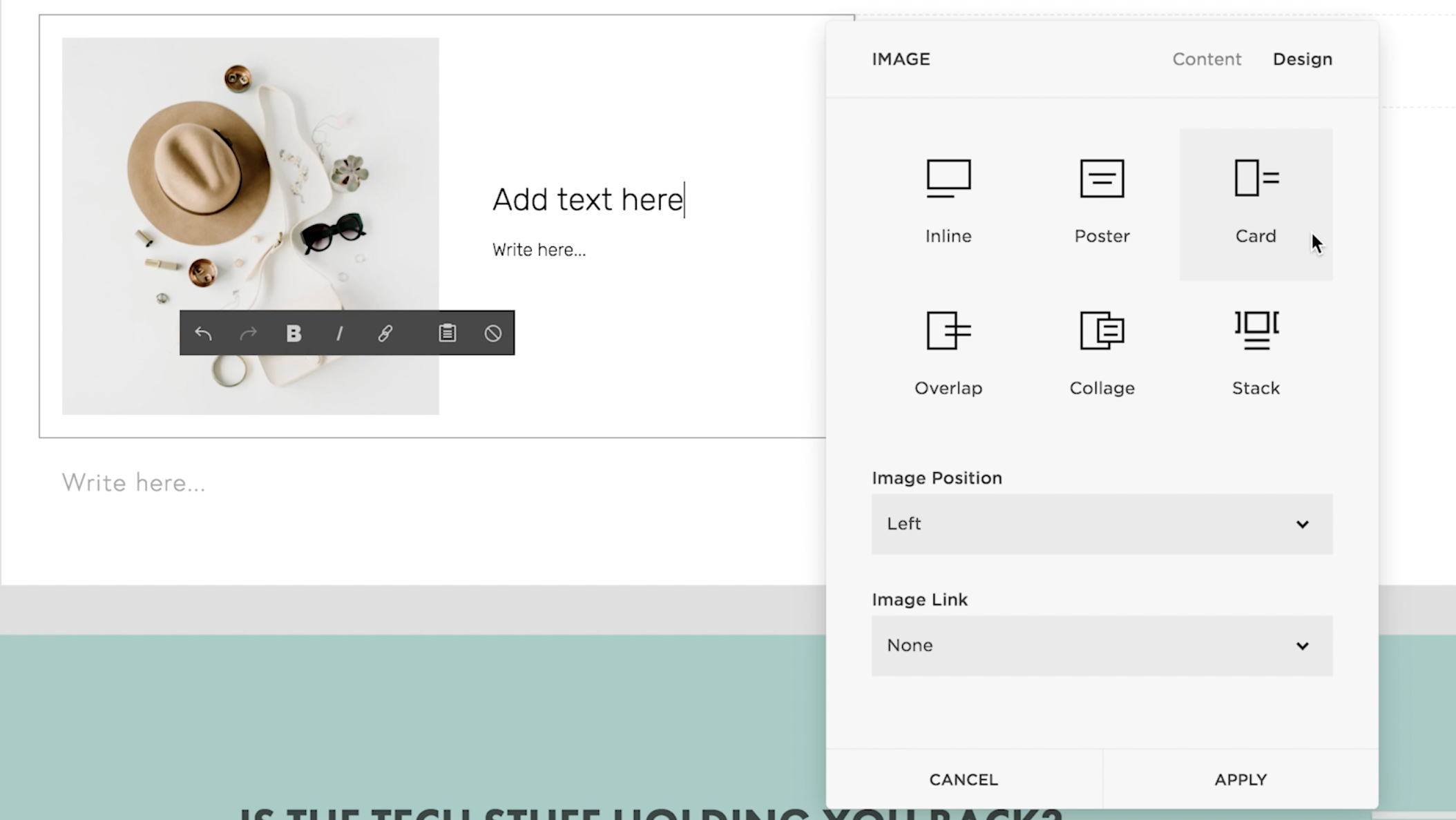
Click Apply. Next, click on Design and you will see six different display options - Inline, Poster, Card, Overlap, Collage and Stack.
Here is what they look like:
1. Inline
2. Poster
3. Card
4. OVERLAP
5. COLLAGE
6. STACK
Now with most of these you can actually add a button as well! Like this:
This is the overlap
Subtitle goes here
It's important to note that you can change a lot of the design settings in the Style Editor. Click Back > Design > Style Editor. If you click on your image, you'll see that editing options will appear and you can change lots about the look.
For example, with the overlap block, you can change the image width, text alignment, current position and more. So, whichever one of the six designs that you choose, make sure that you go into the Style Editor so that you can really make it your own!
And that's it! I hope that you found this tech tutorial really helpful. Let me know by subscribing to my YouTube channel.
You can sign-up for a free trial of Squarespace here. Use the code SIDEKICK10 for 10% off your first year! If you have any other Squarespace questions, just leave them for me in the comments and I'll see you guys soon with another video!


These tech tools will be helpful for you no matter what dream project you're working on right now! 💖