5 Gorgeous Squarespace Website Examples
Heads up: I use affiliate links for my fave products. If you click and purchase, I may receive a small commission at no extra cost to you.
Today, I wanted to share with you 5 gorgeous Squarespace website examples so that you could get a feel for what Squarespace can do and get inspiration for your own site.
Hopefully these examples show you just how much you can customize your Squarespace website and make it your own. Just because you're starting out with a template does not mean that by the end of your website design, it's going to look like that!
Click play or read the post below:
video transcript:
5 Gorgeous Squarespace Website Examples
Here are my picks for 5 gorgeous Squarespace Website Examples:
Example #1: moderncreativepursuits.com
I think this is a really fun and engaging Squarespace website example. She's added quite a few customizations so that it doesn't look like your standard Squarespace site.
Why I love this website:
1. Two levels of navigation items
2. The way her logo overlaps on top of the first banner.
3. The way that she has combined different patterns and textures (this can be really difficult to do, but I think that she has nailed it!)
4. The script font that she has selected.
👉In case you didn't know, you can upload your own custom font to Squarespace. You are not limited to the fonts that are listed within the platform. So keep that in mind!
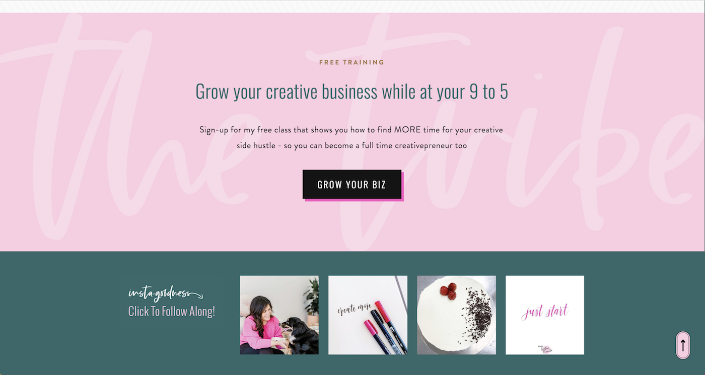
5. The background text here
I think it's really cool to have background text this way. This is actually really easy for you to do yourself. All it is is creating a background image and then overlaying your text on top. You can put whatever you want in the background, put your text on top and it will look pretty cool!
Overall, really great website. Shout out to Janessa Rae for creating it!
Template used in this Squarespace website example: Brine family
Example #2: workparty.com
This website is pretty cool because they've made use of a simple color palette and used different tones of the same color.
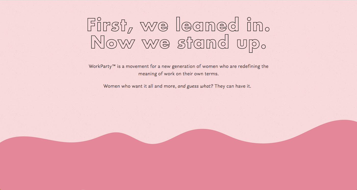
Plus, they've added in details like this:
This is a really cool way of color blocking and making it look like your website sections aren't just straight across. You can play with these lines to make your site more interesting - whether you want to make use of just a diagonal straight line or more of a curve like this.
Then as you can see below, they've added in some movement. This is surprisingly easy to do! You can simply upload gifs to Squarespace to give it some extra movement.
Okay. I have to say I love this one in particular. How cute is that book?
I'm definitely a fan of this Squarespace website and I think it shows little details that make a big impact.
Shout out to Go Live HQ for this design.
Template used in this Squarespace website example: Brine family
Example #3: juliesolomon.net
Next, I wanted to give you a more simple and classic example of a great website.
Julie Solomon’s site really shows what fantastic brand photography can do for your website.
She's kept it very simple with a simple color palette and what I love about this one is that it doesn't have much custom code, so I could show you how to create one like this quite easily.
Keeping it simple is always a great rule in design, so keep that in mind when creating your own website.
Shout out to Jillian Adriana Design for this website design.
Template used in this Squarespace website example: Brine family
Example #4: moniquebryan.com
Site four is one of my very good friends, Monique Bryan. I love her site.
Let's start with the top section here. I love the subtle white text behind her main tagline and I liked the way that she's overlapped her photos. That's a nice detail.
Next, I like the way that she has added in a gradient fade so it goes from the white to the more peachy tone.
Overall, I think it's really nice and simple, yet has lots of personality popping off of the page.
Then she has a testimonial slider to go through all of the kind words people have said about her. That's a nice touch!
And I love this section here too - the way that it loads the different phases. That's really cool.
Shout out to Sendtiment Studio for the design.
Template used in this Squarespace website example: Brine family
Example #5. louisehenry.com
All right, so now for the final website. I'm not gonna lie, I have thrown my own website onto this list!
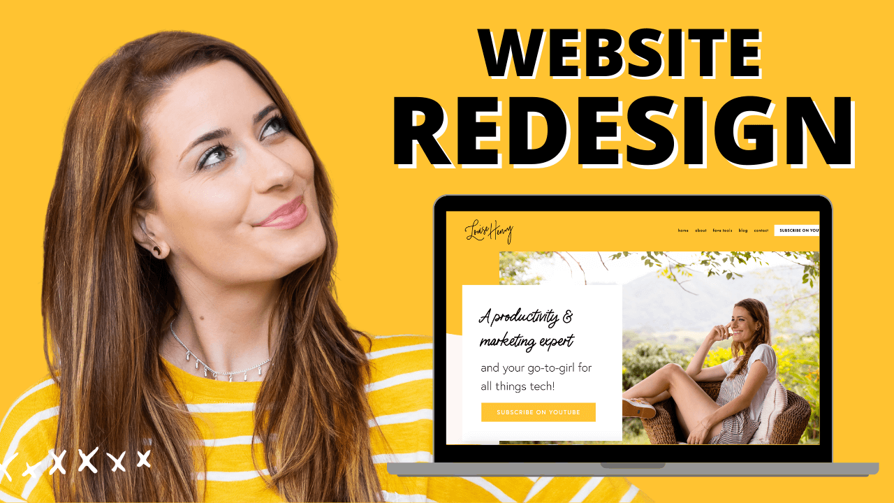
The reason is is because today I'm launching a brand new website!! I'm super excited and wanted to share with you guys. Alright, are you ready? Here's the big reveal...
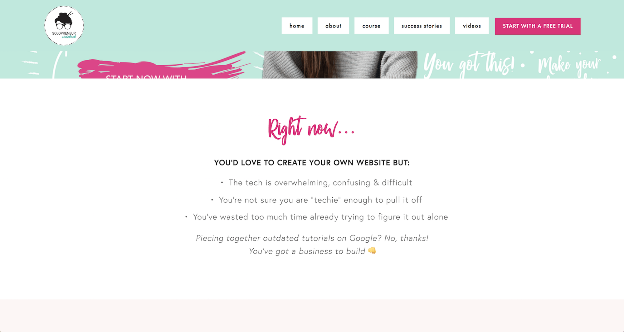
So this is quite the transformation. You guys might know this, but I have an online course called Website that Wows. I felt my website really needed an upgrade and it needed to do exactly that - wow ;) So, I added a lot more color and personality to this site.
I added in a new script font:
And really zeroed in my focus so that it was all about my course, which is the one and only service that I offer.
Then I added a few customizations.
For example, I really wanted my “start with a free trial” button to be visible at all times. So, I made my navigation bar what they call, “sticky.” This just means it remains visible as someone scrolls down your website.
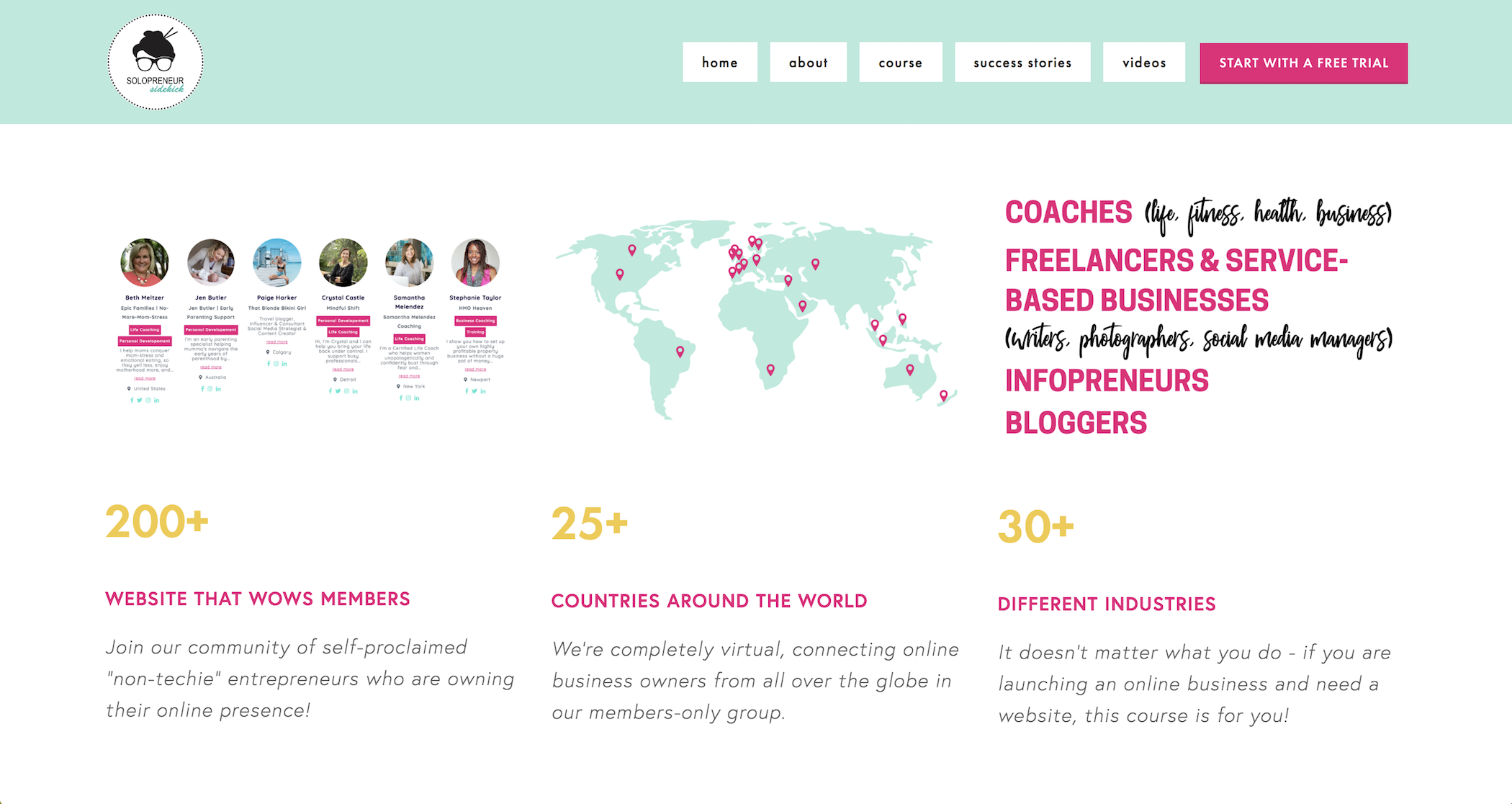
I also wanted to add a bunch of social proof since the program has grown so much. I've enrolled more members from all different countries around the world and felt that my website needed to communicate that.
Design by me of course!
Template used in this Squarespace website example: Brine family
I hope you like the brand new website! I would love to hear your thoughts in the comments. Let me know what you think :)
So that's it. Those are my 5 picks for gorgeous Squarespace website examples. I would love to hear which of those was your favorite. So definitely leave me a comment down below and let me know 👇
If this video has convinced you to use Squarespace for your website, sign up for a free trial of my online course Website that Wows where I walk you through step-by-step exactly how to create your Squarespace website and customize it like this!
GET YOUR FREE ROADMAP HERE:
You can sign-up for a free trial of Squarespace here. Use the code SIDEKICK10 for 10% off your first year! Check out all of the features here.
Any questions? Ask me below 😊















These tech tools will be helpful for you no matter what dream project you're working on right now! 💖